
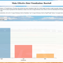
Make Effective Data Visualization
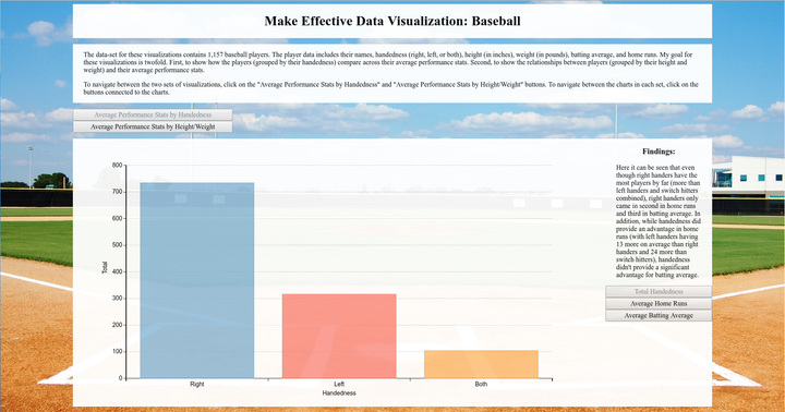
Used a data-set that contains 1,157 baseball players. The player data includes their handedness (right, left, or both), height (in inches), weight (in pounds), batting average, and home runs. This project demonstrates my ability to choose optimal visual elements to encode data and critically assess the effectiveness of a visualization; communicate a story or finding to an appropriate audience using interactive visualizations; and undergo the iterative process of creating a visualization, and build interactive visualizations with dimple.js and d3.js.